About the project
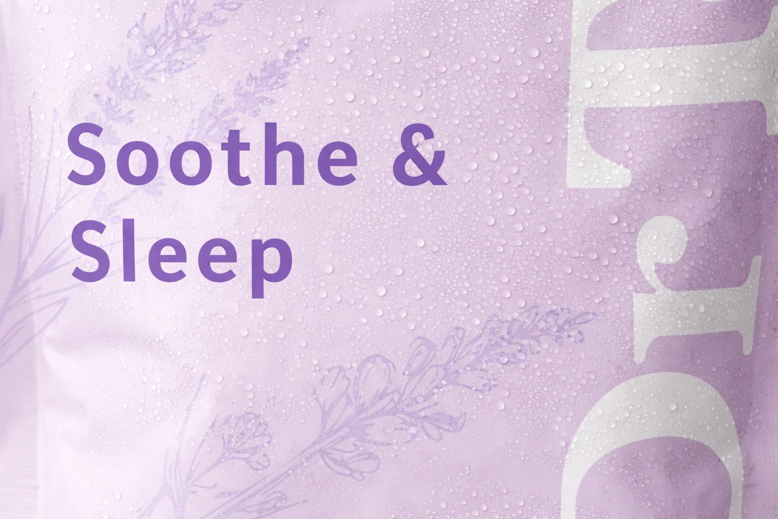
As recovery and fitness become central to younger, more active consumers, the wellness category has begun to shift toward brands that feel restorative, intentional, and lifestyle-oriented. In this project I repositioned Dr Teal’s to appeal to a new audience seeking recovery products that align visually with spa culture, sport, and everyday ritual.
Market and competitor analysis revealed that emerging audiences respond more strongly to packaging that signals calm, natural efficacy, and trust rather than medicinal authority. In response, the visual system moves away from dense information and photographic realism toward simplified typography, restrained color palettes, and illustrative elements that suggest care, balance, and ease of use.
While the look evolves, the brand’s core equity remains intact. Classic typographic cues of Dr Teal’s iconic logo are retained and refined, allowing the packaging to feel familiar yet contemporary. The result is a flexible design system that reframes Dr Teal’s as a modern recovery brand, replacing clinical elements while preserving the brand’s established trust.
Illustrator, AfterEffects, Photoshop


Packaging Design
As recovery and fitness become central to younger, more active consumers, the wellness category has begun to shift toward brands that feel restorative, intentional, and lifestyle-oriented. In this project I repositioned Dr Teal’s to appeal to a new audience seeking recovery products that align visually with spa culture, sport, and everyday ritual.
Market and competitor analysis revealed that emerging audiences respond more strongly to packaging that signals calm, natural efficacy, and trust rather than medicinal authority. In response, the visual system moves away from dense information and photographic realism toward simplified typography, restrained color palettes, and illustrative elements that suggest care, balance, and ease of use.
While the look evolves, the brand’s core equity remains intact. Classic typographic cues of Dr Teal’s iconic logo are retained and refined, allowing the packaging to feel familiar yet contemporary. The result is a flexible design system that reframes Dr Teal’s as a modern recovery brand, replacing clinical elements while preserving the brand’s established trust.
Illustrator, AfterEffects, Photoshop
See next project
